
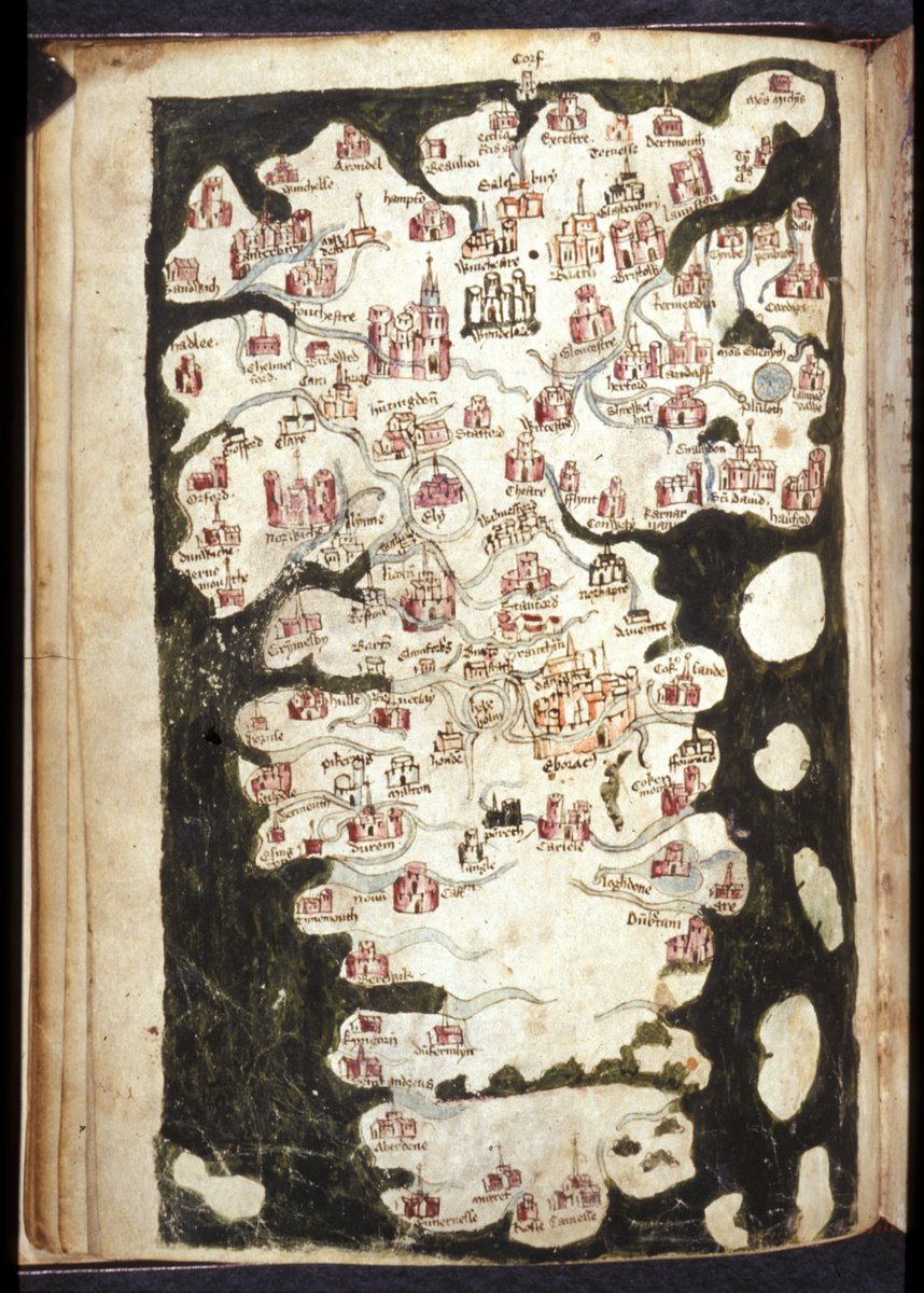
Recently on Twitter, Vintage Maps posted a fifteenth century map of England, Scotland, and Wales that was somewhat unusual in that South was at the top, so Scotland was at the bottom.
Numerous people found it bizarre or irritating and it was obvious that many people are somehow convinced that North must be at the top of a map. I can understand why, but there is no law, scientific necessity, or any compelling reason whatsoever as to why maps should be so orientated that North is at the top and in fact at other times and in other cultures maps did in fact have other orientations. To quote Jerry Brotton on the topic:
Ortelius describes the position from which a viewer looks at a world map, which is closely related to orientation – the location from which we take our bearings. Strictly speaking, orientation usually refers to relative position or direction; in modern times it has become established as fixing location relative to the points on a magnetic compass. But long before the invention of the compass in China in the second century AD, world maps were oriented according to one of the four cardinal directions: north, south, east and west. The decision to orientate maps according to one prime direction varies from one culture to another (as will be seen from the twelve maps discussed in this book), but there is no purely geographical reason why one direction is better than any other, or why modern Western maps have naturalized the assumption that north should be at the top of all world maps.
Why north ultimately triumphed as the prime direction in the Western geographical tradition, especially considering its initially negative connotations for Christianity (discussed in Chapter 2), has never been fully explained. Later Greek maps and early medieval charts, or portolans, were drawn using magnetic compasses, which probably established the navigational superiority of the north-south axis over an east-west one; but even so there is little reason why south could not have been adopted as the simplest point of cardinal orientation instead, and indeed Muslim mapmakers continued to draw maps with south at the top long after the adoption of the compass. Whatever the reasons for the ultimate establishment of the north as the prime direction on world maps, it is quite clear that, as subsequent chapters will show, there are no compelling grounds for choosing one direction over another.[1]
It’s not just maps, all earlier cultures that had reached a certain level of development had buildings and other structures aligned to the four cardinal directions long before the invention of the compass, so how? Before I answer, I should explain that all that follows applies to the northern hemisphere, as all the maps discussed were all created in the northern hemisphere.
Brotton:
Etymologically, ‘orientation’ stems from the original root oriens, which refers to the east, or the direction of the rising sun. Virtually all ancient cultures record their ability to orient themselves according to an east-west axis based on observations of the rising (eastern) and setting (western) sun, and a north-south axis measured according to the position of the North Star or the midday sun.[2]
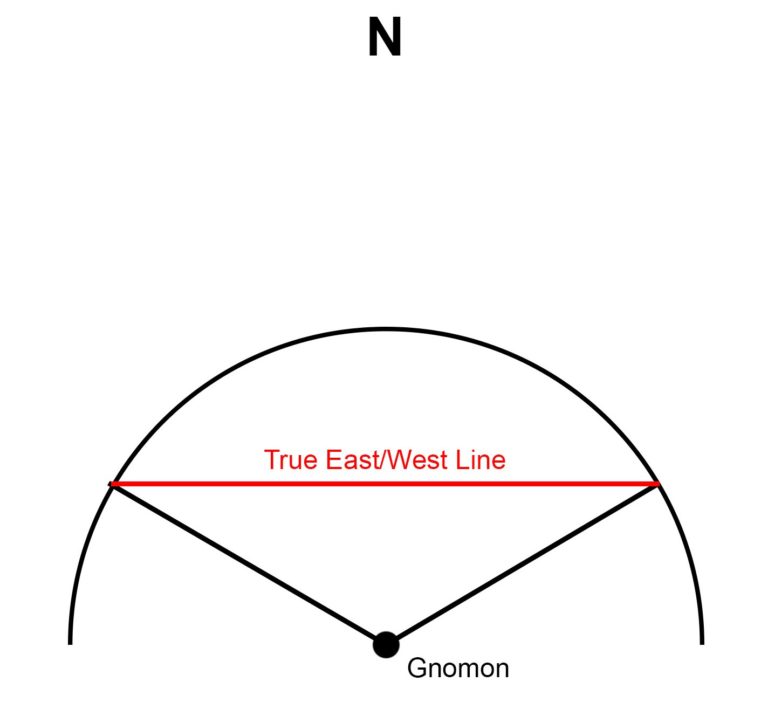
However, these observations are not accurate enough to orientate a building, so how do you do that without a compass?
To lay out a basic east-west, north-south cross on the ground you just need a stick, or to give it its fancy name a gnomon, and a piece of string. You place the stick upright in the ground and draw a circle around it using the piece of string. You follow the shadow of the stick, which varies in length during the day and when it just touches the circle you mark that point. When it just touches the circle for the second time you mark that point. If you now join up those point the connecting line runs east-west. A north-south line is a right angle to this through the middle of the circle.
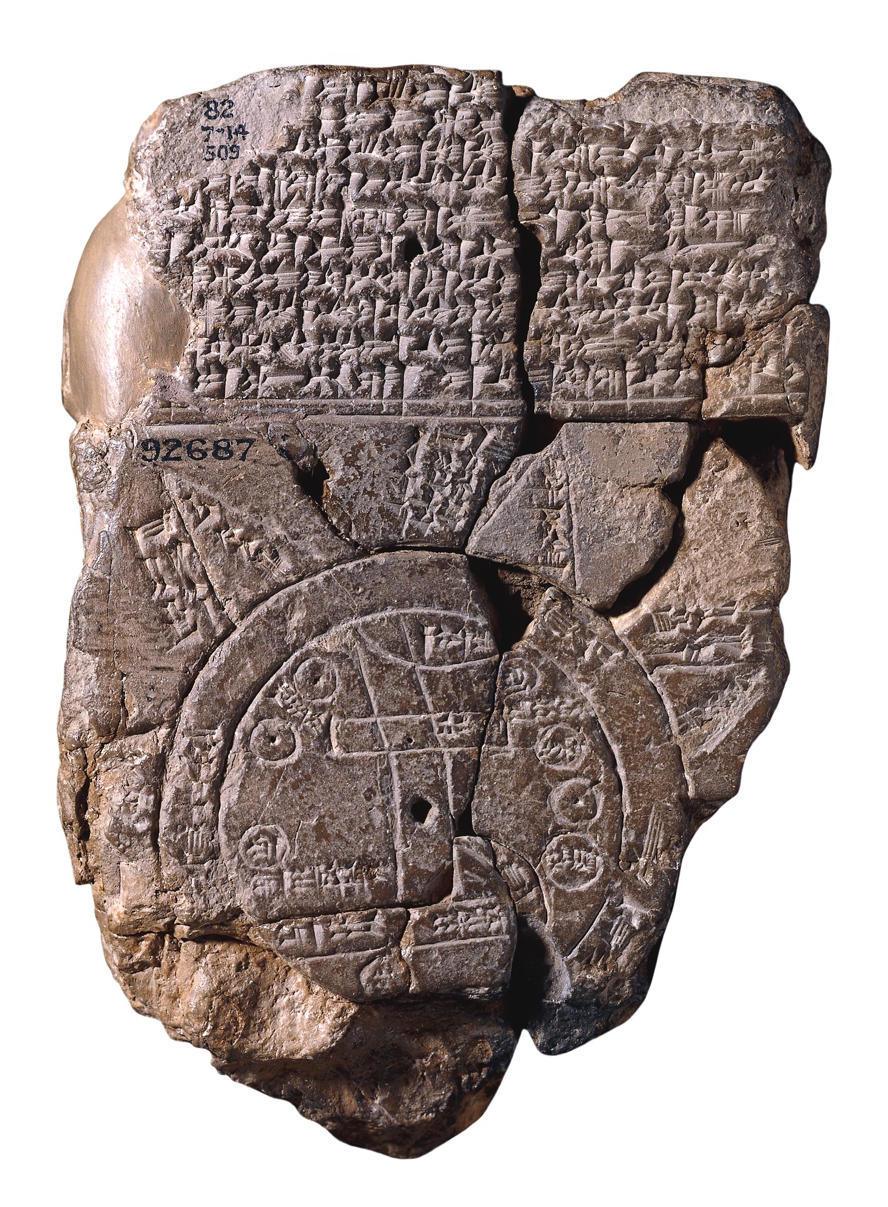
The oldest world map, the Babylonian Imago Mundi (sometime between the 9th and 7th centuries BCE) is centred on the Euphrates, which runs north-south, so it has north at the top.
Greek mapmakers also orientated their maps with north at the top, which I suspect is strongly influenced by the fact that the Mediterranean, which is at the centre of all Greek cartography, runs east-west, combined with the importance of the pole star in Greek astronomy.

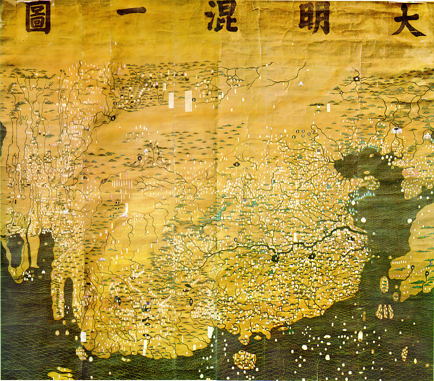
Chinese maps were mostly orientated with north at the top, although the Han dynasty maps (202 BCE–202 CE) have south at the top. Brotton argues that in China the sun comes from the south, so the emperor looks to the south towards the sun and the people look to the north when looking up to the emperor, hence the north orientation.
Turning once again to Brotton:
Such orientation [east-west, north-south] was as much symbolic and sacred as directional. In polytheistic sun- worshipping cultures, the east (oriens) was revered as the direction of renewal and life, closely followed by south, while the west was understandably associated with decline and death, and north with darkness and evil. The Judeo-Christian tradition developed these associations by orienteering places of worship as well as maps towards the east, which was ultimately regarded as the location of the Earthly Paradise. In contrast the west was associated with mortality, and the direction faced by Christ on the cross. The north became a sign of evil and satanic influence and was often the direction in which the heads of excommunicants and the unbaptised faced when they were buried.[3]
The European medieval mappae mundi (mappa mundi literally means cloth of the world) were not topological or geographical maps as we known them, but rather philosophical maps, which were intended to illustrate the Christian world view. In the middle, they had the Holy City, Jerusalem, which according to medieval Christian thought lay at the centre of the world. East was at the top with the Garden of Eden, as it stands in the Bible, “And the Lord God planted a garden eastward in Eden” (Genesis 2:8).

Continuing with Brotton:
Islam and mapmakers like al-Idrīsī inherited a similar reverence for the east, although it developed an even stronger interest in the cardinal directions with the Qur’ānic injunction to its believers to pray in the sacred direction of Mecca, regardless of their location on the globe; finding the direction (known as qibla, or ‘sacred direction’) and direction to Mecca and the Kā’aba inspired some of the most complicated and elaborate maps and diagrammatic calculations of the medieval period. Most of the communities who converted to Islam in its early phase of rapid international expansion in the seventh and eight centuries lived directly north of Mecca, leading them to regard qibla as due south. As a result, most Muslim world maps, including al-Idrīsī were orientated with south at the top. This also neatly established continuity with the tradition of the recently conquered Zoroastrian communities in Persia, which regarded south as sacred.[4]

Abu Abdullah Muhammad al-Idrisi al-Qurtubi al-Hasani as-Sabti (1100–1165) to give him his full Arabic name, was a Muslim geographer and cartographer, who lived for many years in Palermo, at the court of the Norman king of Sicily Roger II (1095–1154).
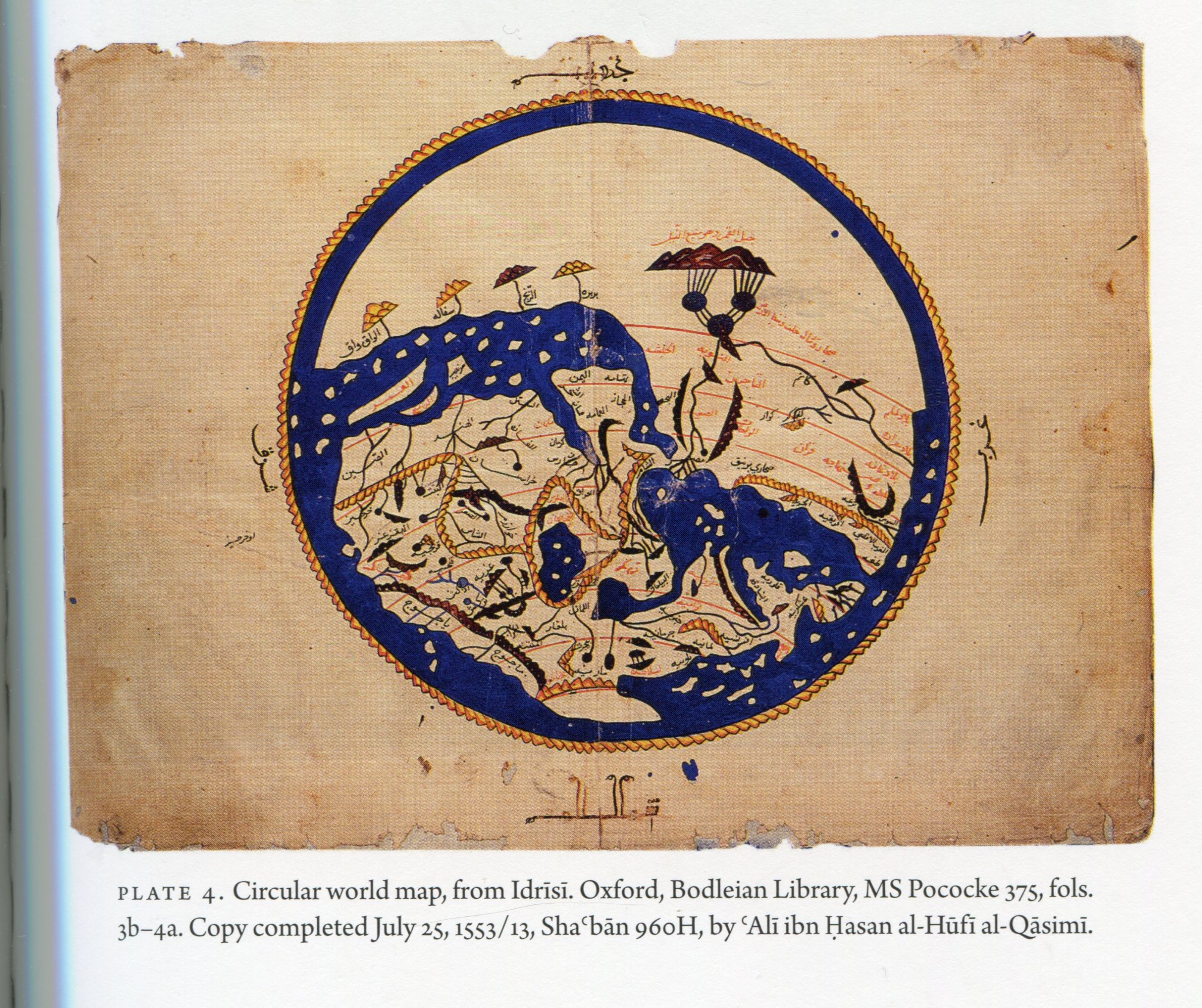
Roger commissioned him to create a map of the world and the result after many years work was the Tabula Rogeriana published in 1154. It is considered to the most accurate map of the world in pre-modern times. It, of course, has south at the top, as did all medieval Islamic maps.

I think it was possibly the influence of medieval Islamic maps that led to south orientated maps in Europe in the late medieval early Renaissance period, such as the map that inspired this whole post. Another well-known example of a south orientated European Renaissance map is the 1500 Romweg map of the Nürnberger cartographer and instrument maker Erhard Etzlaub (c. 1460–c. 1531).

This is a printed roadmap for pilgrims travelling to Rome for the Holy Year in 1500. It is considered to be the first modern European map with a scale to determine distances. All of Etzlaub’s maps have south at the top.
Interestingly the Gough Map of Britain, which is difficult to date, but which was probably produced in the late fourteenth century has east at the top like the mappae mundi.

Earlier than Etzlaub, the first medieval, European “mathematical” maps, which emerged as the mappae mundi were still being produced were the portolan charts, which began to appear in the Mediterranean as navigation aids in the fourteenth century. These are mostly orientated with north at the top but there are examples with other orientations.
The 1559 chart from Joan Oliva of the Mediterranean has west at the top but the small inserted circular chart of the Atlantic is interesting. If viewed along the axis of the main chart it also has west at the top but if viewed alone for itself, it has north at the top.

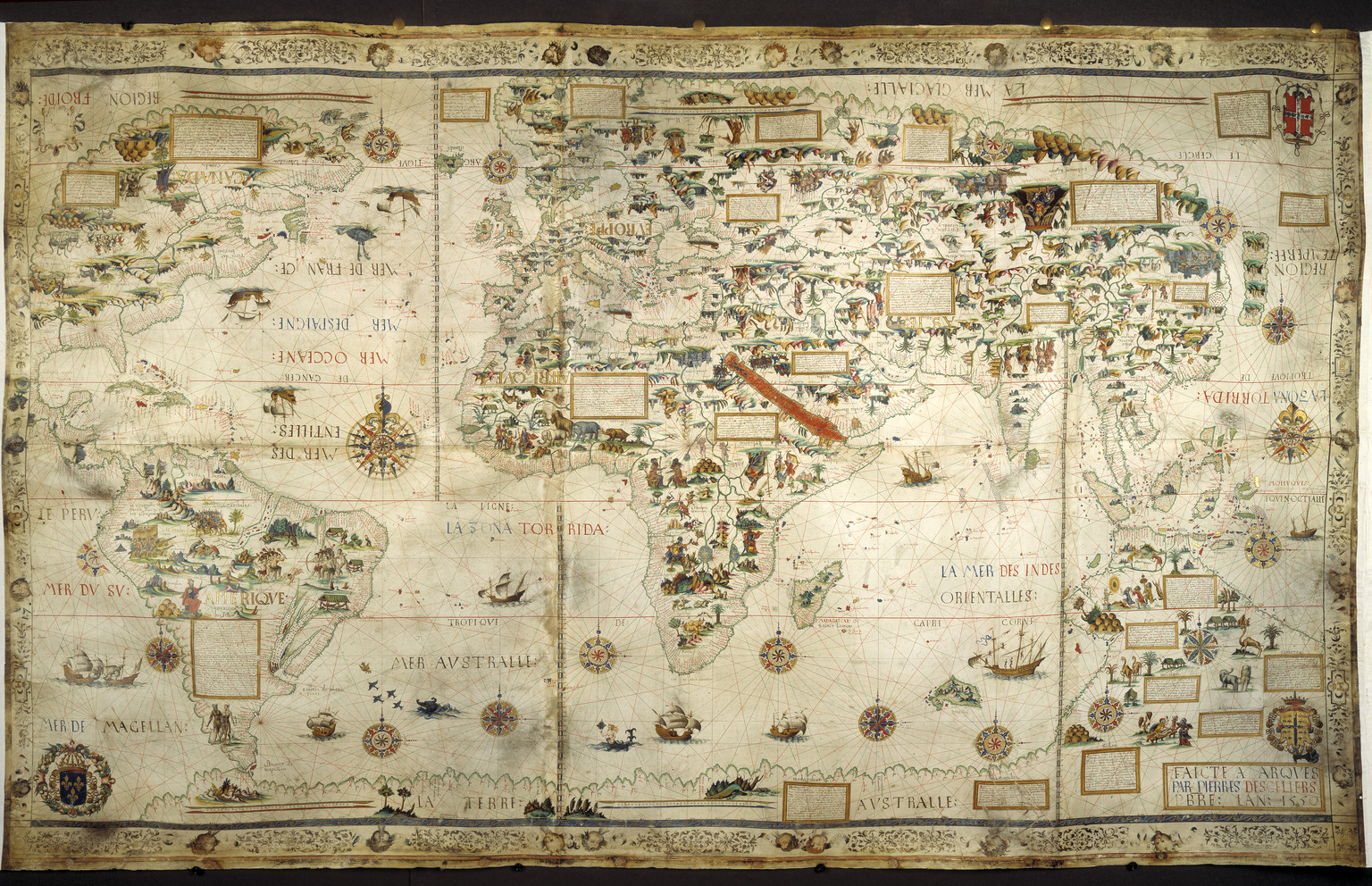
Pierre Desceliers’ 1550 world map, probably intended to be laid out on a table has two orientations. If viewed from the southern hemisphere it has north at the top but if viewed. from the northern hemisphere it has south at the top. The two orientations are indicated by the written labels.
We find the same double orientation on the earlier Mediterranean chart of Albino de Canepa from 1498, indicated by the pavilions.

Jorge Aguiar’s Mediterranean map of 1492 is south orientated

As is the world map of Nicolas Desliens of 1566.*
I think that the re-emergence of the Ptolemaic world map at the beginning of the fifteenth century and the development of modern cartography that it triggered which eventually led to the dominance of north orientation in mapmaking, perhaps combined with the increased use of the magnetic compass.
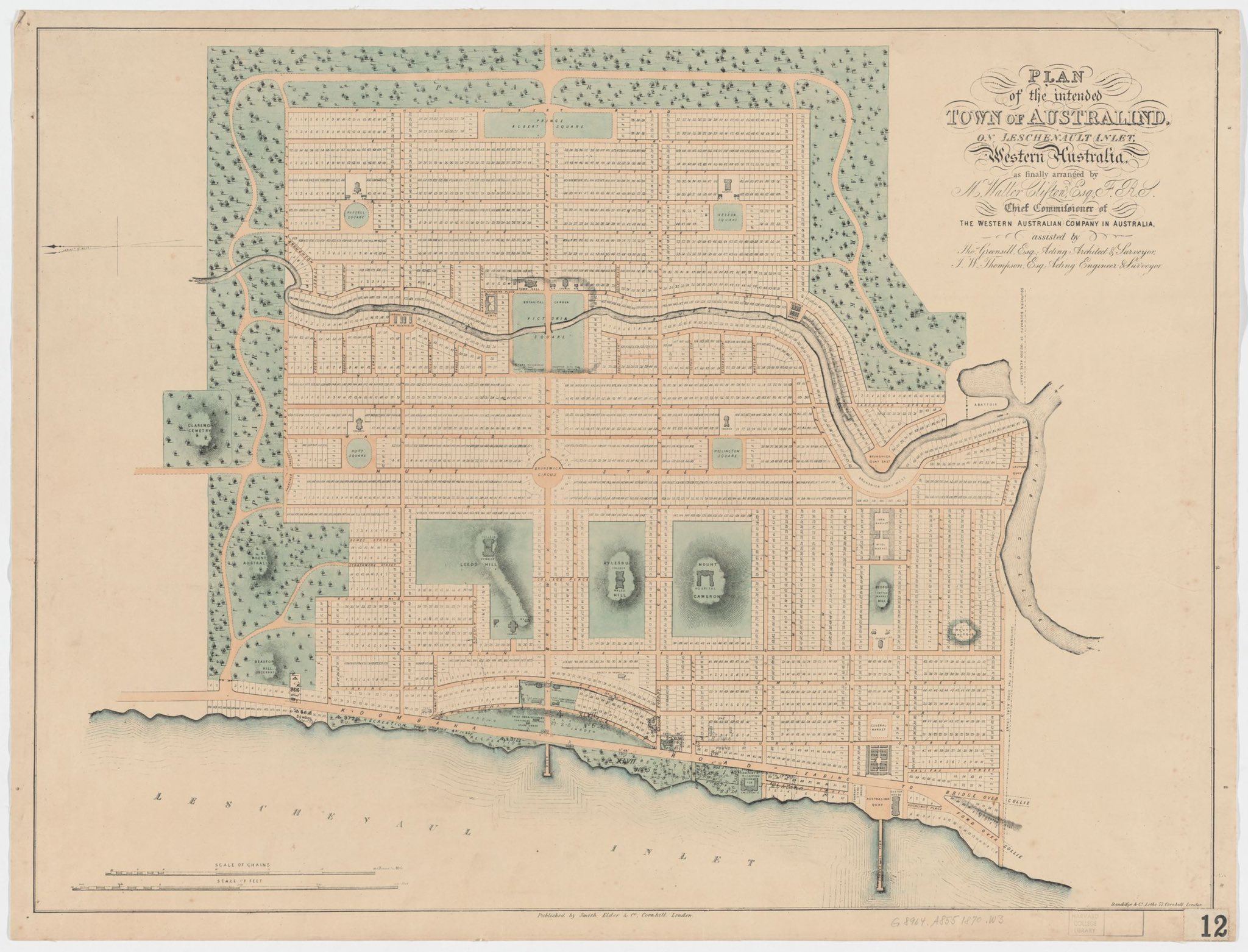
Of course, town plans, estate maps and plans of large building complexes are also maps and these are often not north orientated but according to what is the most rational way to view them as in this town plan.
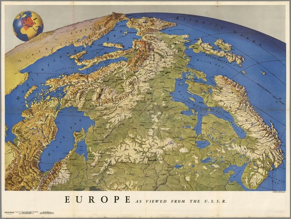
There is strong evidence that the current universal north orientation of maps leads to the way that the viewer perceives the world. Other orientation change our perception. We start with a map of Europe viewed from the USSR perspective
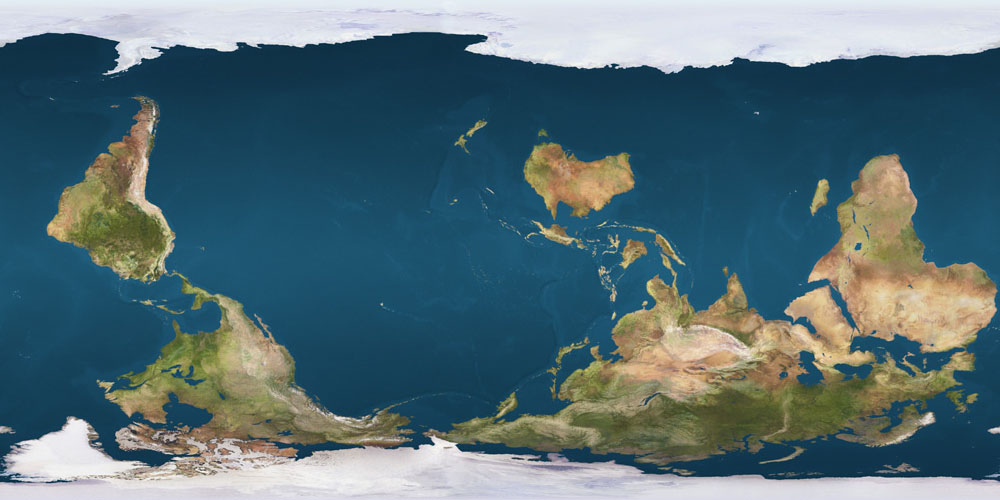
Various cartographers have created modern south orientated maps to provoke people into reconsidering their perceptions of the world. A good example is this world map.

Interesting in this context, whilst editing this blog post on Sunday 27 August 2022, I stumbled across a conference presenting and discussing the Te Moana Meridian concept on that day. This is a political movement attempting to move the prime meridian 180° from Greenwich to the middle of Te-moana-nui-o-Kiwa (the Pacific Ocean in Te Reo Māori (‘the language of Māori’)). If world maps were thus centred, instead of one the middle of the Atlantic, it would radically change peoples perceptions of the world.
Te Moana Meridian explores how the arbitrary location of the prime meridian reinforces British and Western imperial and colonial hegemony, historically, and into the present. Through a polyphony of tactics the exhibition proposes a practical means for redressing this skewing of global diplomacy. In centering Te Moana-Nui-ā-Kiwa, the exhibition proposes a more equitable and multilateral system for negotiating time and space.
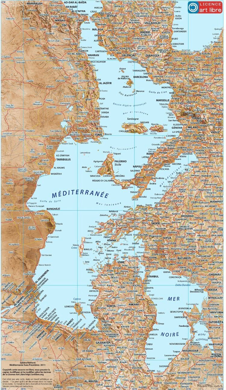
Finally, I close with this west orientated map of the Mediterranean by Sabine Réthoré and I can’t improve on the description by Amro Ali in this article
The next time you look at a map, maybe you should turn it upside down or even sideways and try to see what it depicts from a new perspective. There really is no reason why north should be at the top.
*A special thanks goes to Matthew Edney , when inadvertently drew my attention to the Nicolas Desliens World Map on Twitter as I was composing this blog post
[1] Jerry Brotton, A History of the World in Twelve Maps, Allen Lane, 2012, pp. 10-11
[2] Brotton p. 57
[3] Brotton p. 57
[4] Brotton pp. 57-58
[5] Wood, D., Kaiser, W. L., Abramms, B., Seeing through Maps: Many Ways to See the World, ODT Inc., 2006, pp. 50-51