# The Captivating Realm of Chromostereopsis: An Illusion of Depth in Color Perception
Have you ever taken note of an image where hues seem to exist at various depths, despite being on a flat surface? Certain individuals experience a pronounced 3D effect when viewing specific color pairings, whereas others may perceive nothing out of the ordinary. This intriguing visual phenomenon is referred to as **chromostereopsis**, a term that encapsulates how distinct colors can conjure an illusion of depth.
## What is Chromostereopsis?
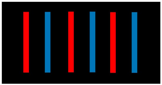
Chromostereopsis is an optical illusion where certain colors appear positioned on different visual planes. Generally, red seems to be nearer than blue, though this perception can differ among individuals. For some, blue might seem to be in the foreground. The intensity of the effect varies, being pronounced for some while barely discernible for others.
This illusion is remarkable because depth perception usually depends on **stereopsis**, which happens when our two eyes capture slightly varied images that our brain amalgamates into a singular 3D perception. However, chromostereopsis generates a depth effect from just one, static image.
## Why Does Chromostereopsis Occur?
The precise origins of chromostereopsis continue to be a topic of discussion, but various factors contribute to this illusion:
1. **Wavelength Variations**: Red and blue light have differing wavelengths; red light possesses a longer wavelength while blue has a shorter one. The optical system of the eye finds it challenging to focus them simultaneously at the same point, thus causing the illusion of varying depths.
2. **Chromatic Aberration**: The eye’s lens refracts different colors at unique angles, leading them to converge at slightly different positions on the retina. Consequently, the brain perceives one color as more distant than the other.
3. **Pupil Arrangement and Eye Anatomy**: The manner in which light enters the eye, shaped by the structure of the cornea and lens, can enhance or lessen the effect. Some individuals’ eyes produce more optical distortions than others, resulting in pronounced or subtle chromostereopsis experiences.
4. **Illumination and Viewing Conditions**: Brightness and contrast can amplify the illusion. Observing the image in dim lighting, boosting screen brightness, or blinking rapidly may heighten the depth effect.
## Individual Differences in Chromostereopsis
Not everyone perceives chromostereopsis identically. While most tend to see red as closer and blue as more distant, a small percentage perceive this effect inversely. Moreover, the use of glasses or corrective lenses can intensify the illusion for certain individuals.
An especially fascinating aspect of chromostereopsis is that it vanishes when one eye is closed. This indicates that the illusion necessitates input from both eyes to generate the perception of depth, affirming its nature as a **stereo illusion** rather than merely a basic contrast effect.
## Chromostereopsis in Art and Design
Artists and designers have historically exploited the contrasts between red and blue to produce striking visual phenomena, even if their understanding of the underlying science was limited. Traditional **stained glass windows** frequently pair red and blue, possibly leveraging chromostereopsis to render artwork more dynamic.
The same principle is occasionally applied in **graphic design and television set design** to evoke a sense of depth and separation. A notable example is the backdrop of the panel show *Have I Got News for You*, where alternating red and blue components enhance the depth illusion.
## The Science Behind Chromostereopsis
Despite its well-established presence, chromostereopsis remains a complex and not thoroughly understood phenomenon. Researchers such as Akiyoshi Kitaoka have contributed to the academic discourse, underscoring the role of optical physics, human perception, and brain processing in this visual illusion.
For those eager to explore the subject further, Kitaoka’s contributions in the *Encyclopedia of Color Science and Technology* (2016) delve into the interaction of color and depth perception. Additionally, Michael Bach’s work offers further revelations regarding how light and vision interrelate to create these astonishing effects.
## Conclusion
Chromostereopsis stands as a fascinating illustration of how our brains and eyes interpret the world in surprising manners. This illusion showcases the intricacies of human vision, reminding us that our perceptions are not always a flawless reflection of reality. Whether you are an artist, designer, or simply intrigued by visual perception, chromostereopsis serves as a compelling instance of the convergence of color, depth, and optical science in everyday life.
### Have you ever experienced this illusion? Try examining various combinations of red and blue on a bright screen in a dark room and see if the depth effect manifests for you!