**The Mystery of Chromostereopsis: Decoding the Depth Illusion**
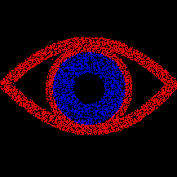
Chromostereopsis is a captivating visual experience that has fascinated both researchers and casual viewers alike. This compelling visual illusion arises when distinct wavelengths of light produce a sensation of depth, even within a still, two-dimensional picture. The intriguing feature of chromostereopsis is its inconsistency among different people. While some might notice pronounced depth disparities between colors in an image — frequently sensing that one hue is nearer than the other — others may not observe anything out of the ordinary. For example, when viewing a photograph of a blue iris in a red eye, some individuals might describe it as possessing considerable depth, whereas others perceive merely a flat image devoid of any extraordinary effects.
This phenomenon can be amplified under various circumstances; observing the image in a dimly lit room, tweaking screen brightness, or even blinking quickly can enhance the illusion. Although the image remains stationary, the introduced depth illusion can create the impression that colors are moving independently when one’s perspective shifts. This peculiarity can be confusing, as traditional stereo-depth illusions typically depend on two images seen separately by each eye — similar to the use of 3D glasses in theaters. Chromostereopsis, on the other hand, is produced with a single image, requiring the visual system to combine data from both eyes. This can be illustrated by shutting one eye and noticing the depth effect diminish, highlighting its binocular nature.
Interestingly, not everyone perceives chromostereopsis in the same manner, or even experiences it at all. It has been observed that individuals who are stereoblind — lacking the ability to perceive depth via binocular cues — do not experience this illusion. The variations in the perceived spatial arrangement between colors like red and blue contribute to the enigma; for many, red seems to advance while blue appears to recede. However, this is not a universal experience, and some individuals perceive the depth effect in reverse.
The underlying principles of chromostereopsis are not completely understood, despite numerous efforts to clarify it. It is speculated to originate from the dispersion of light and the manner in which different wavelengths are refracted in our eyes, resulting in varying focus levels on the retinas. This discrepancy may also explain why glasses can occasionally enhance the effect. The roles of luminance, color contrast, and background on the potency of the illusion continue to be a topic of research.
The use of chromostereopsis extends beyond optical science; it permeates art and media. Artists and designers frequently employ color contrasts to create a sense of depth and fascination, whether inadvertently or as an intentional decision inspired by this phenomenon. From the stained glass windows of the Gothic period to modern television design, chromostereopsis finds its role in enriching visual experiences.
For those eager to explore the science behind visual perceptions and illusions like chromostereopsis, there are extensive resources available, such as chapters on depth illusions in esteemed publications and scientific references in encyclopedic volumes focused on color science.
Aficionados who wish to deepen their understanding or experiment with generating such images may find value in examining resources and dialogues available on the subject, often merging artistic intuition with scientific inquiry to unveil the intricacies of chromostereopsis.